What is Responsive Web Design
I’ve raised the topic of responsive web design on a few occasions previously, and it’s important enough to anyone with a presence on the Internet for it to be a subject that’s worth exploring again. In simple terms, Responsive Web Design (RWD) covers the aspects of a site which maximise accessibility, ease of use and the visitor experience. Via aspects of design such as lay-out and coding, RWD ensures that a site can be read, utilised and navigated no matter what the nature of the device through which it is being accessed. From a tablet to a smart phone via a laptop or our old friend the desk top computer, a site which utilises RWD will be at home no matter where it appears, with annoying aspects such as resizing, panning and scrolling kept to a bare minimum.
As designers, however, it can easy to slip into a discussion of the technical parameters of RWD without capturing its essence for the lay person. Put simply, it creates a one size fits all website, capable of snapping into position and working perfectly with the device at hand (and ‘at hand’ is more and more often an accurate description of how people access sites), a concept which is obviously beneficial when put like that, but one which some people still fear is just the kind of thing that web designers mention when they want to bump the price up a little bit.
Time & Money
The idea, however, that creating a responsive website will be prohibitively expensive, is more than a little misguided. The truth of the matter is that any initial extra outlay involved in developing a website with responsiveness engineered into it is more than off-set by the savings this can bring elsewhere. By creating a website with this chameleon-like ability to work with its’ surroundings, developers remove the need to create duplicate websites; one for desktop, another for mobile etc. Post development, a responsive website will continue saving the client time and money, since it removes the need to update and maintain this multiplicity of sites. Any short term cost is more than offset by the long term and ongoing gains generated by a responsive website.
Mobile Devices
You don’t really need to be an expert to note the rise of internet access via mobile devices. All you really need to do is walk down any street, sit in any restaurant or take a ride on any train. What you’ll see is person after person head bowed, device in hand, eyes on the screen. There’s more to this than simple anecdotal evidence, however. In May of this year Google released a statement confirming what many people already suspected, namely that ‘more Google searches take place on mobile devices than on computers in 10 countries including the US and Japan’ (Source: http://goo.gl/Q7MDpQ ), whilst other statistics showed that worldwide internet usage via mobile devices now makes up 52.7% of all access, a figure which is predicted to rise to 63.4% by 2017 (Source: http://goo.gl/giIuaL )
The obvious conclusion to draw from the exponential rise of mobile access is that ignoring responsive design is a risk which developers can no longer really take. Put simply, if your site isn’t there for mobile devices, then it’s hardly really there at all, and RWD is set to become the industry norm.
User Experience
‘Content is King’ is one of those clichés which has become a cliché because it happens to be true. The nature of any content, however, is only ever going to be as effective as the user experience delivering it. Visitors want to be able to access content wherever they are, whatever the time, through the device which happens to be most convenient. Responsive web design ensures that this is the case, and keeps King Content firmly ensconced on the throne.
Taking the Responsive Route
We saw the direction that the technology was moving in and decided to hitch a ride, designing and coding in a manner which fully embraced RWD. We like to think the results speak for themselves; a suite of sites ranging from one page designs to online shops and corporate projects. Despite the variety of our work, every site we produce has one thing in common – they all look amazing.
Our clear and readable aesthetic leant itself readily to the discipline of RWD. If anything, we’ve been compelled to make our sites even more minimal and ‘cleaner’ than they were before, disciplines which have honed our skills and sharpened our aesthetic.
Don’t Wait for the Game to Change, It Already Has
Anyone au fait with the trends and developments of web design might feel that, so far, I’ve merely been stating the obvious, underlining a position which developers have been coping with for some time. The rules of the game are changing, however, and as with many such things the changes can be traced back to the Search Engine behemoth that is Google.
On April 21st of 2015, Google introduced a new search algorithm designed to place mobile friendly sites higher than other sites. This means that the all-important Google ranking – the metric by which the success or otherwise of a website can easily be measured – is now dependent on a site being responsive. We keep that at the front of our concerns through every stage of development, keenly aware of the fact that the best site in the world is frankly no use if it isn’t being discovered.
Where Now?
Combine the shift in customer behaviour toward mobile searches with the manner in which Google has responded to this and you have a situation in which RWD is no longer an option but has become a necessity. By ensuring your site is responsive you’ll maximise both the reach and the user experience when it has been found, both of which are key aspects of driving revenue.
If you’re planning a new website then we can’t be clear enough. It has to be responsive. It has to have the elasticity to stretch and shrink to fit any device. It has to be mobile friendly whilst maintaining its aesthetic.
All of which is what we specialise in producing, and if your curiosity has been piqued, then take a look at the following examples of the responsive work which we produce:
CASE STUDY 1:
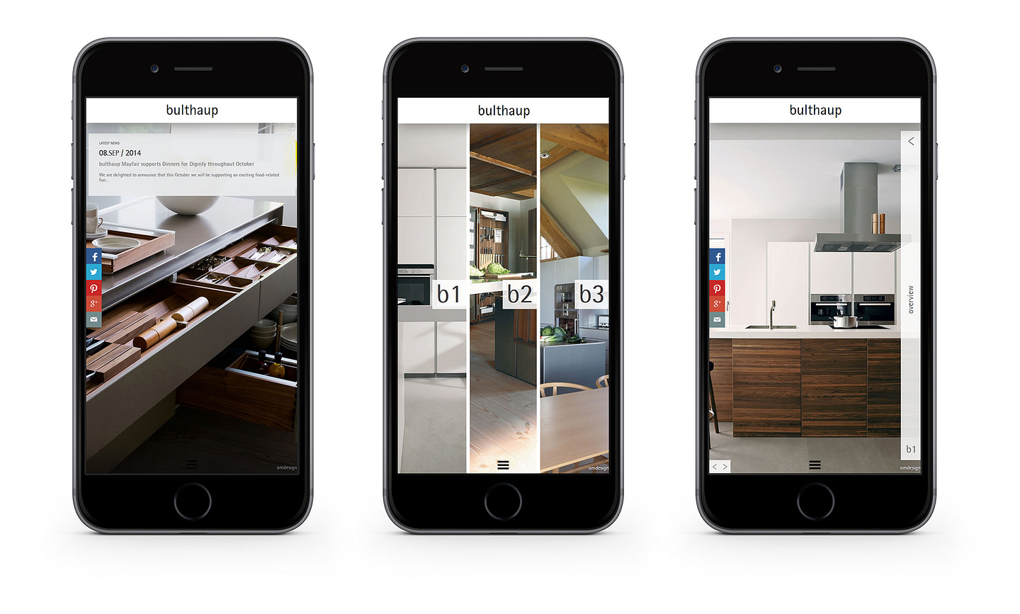
Bulthaup – German kitchen manufacturer, renowned worldwide for its architecture of living spaces.
Fully device responsive content managed website.

CASE STUDY 2:
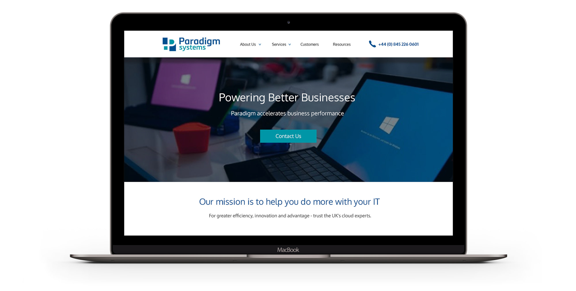
Paradigm Systems – Microsoft cloud IT solutions website with case studies.

CASE STUDY 3:
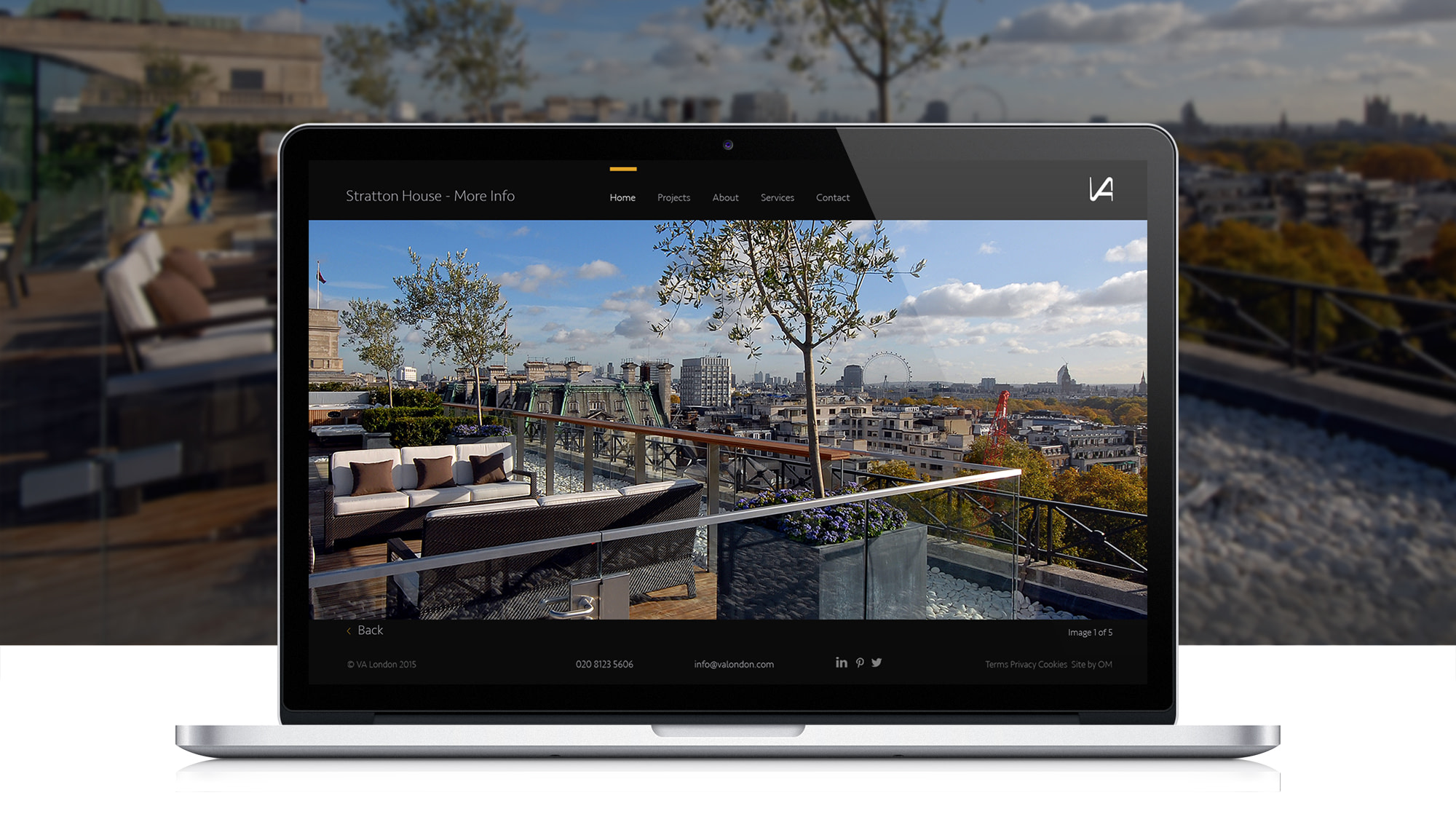
VA London Architects – portfolio websites.

A great series of projects from the last few months. If you’re interested in a custom design responsive website, get in touch