Visual Identity for Photo Productions
Overview
What We Did

Photo Productions is a London based company that specialises in designing and producing premium Photobooks for both amateur and professional photographers.

What We Did
Challenge
The team at Photo Productions wanted a simple but eye catching logo that would represent their premium Photobook service. They wanted a logo that was interesting and well-crafted yet accessible enough to appeal to the public and their non-professional clients.
Solution

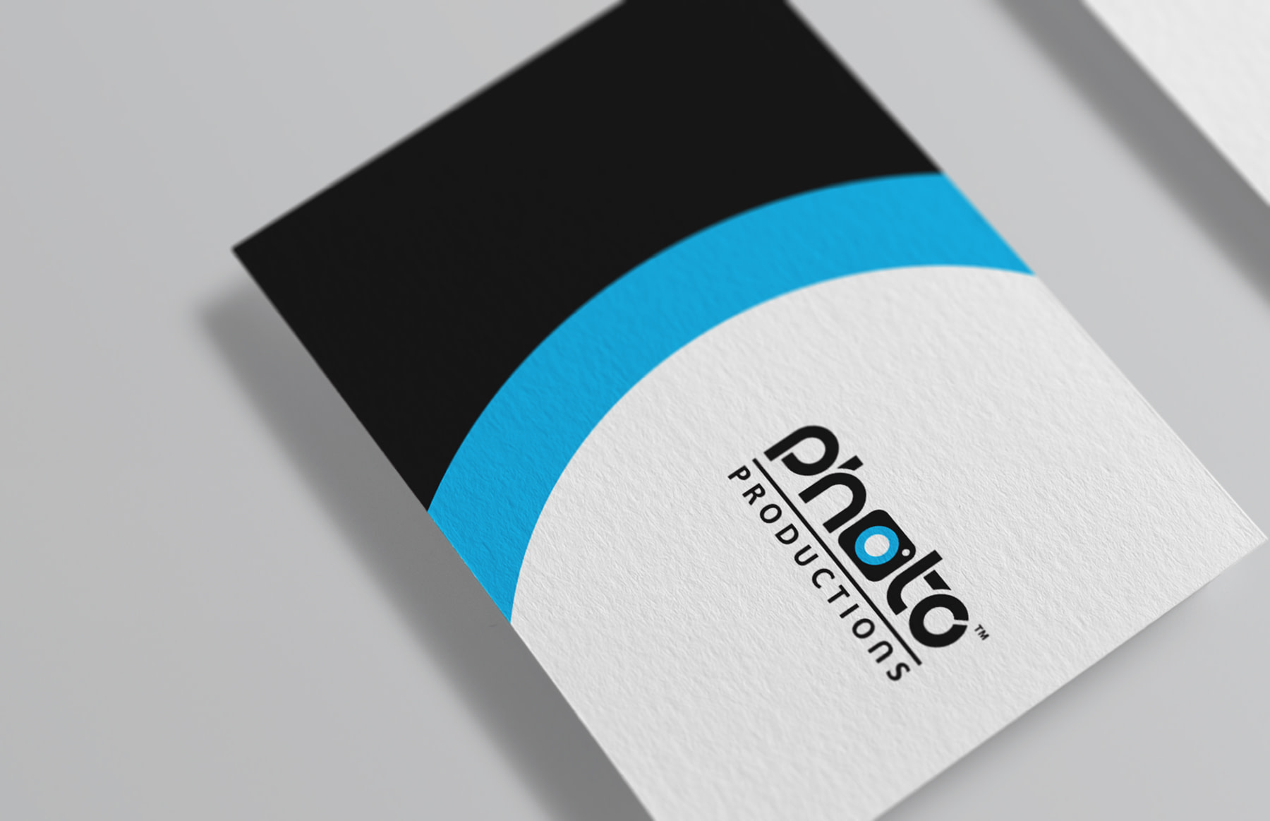
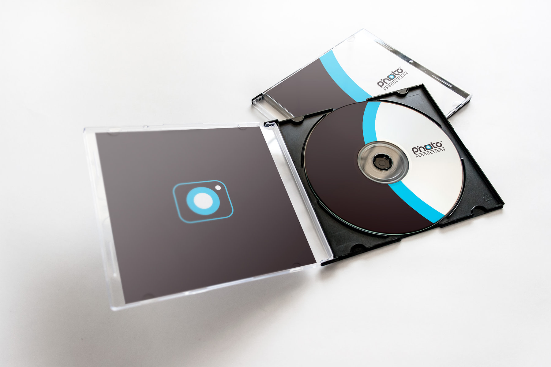
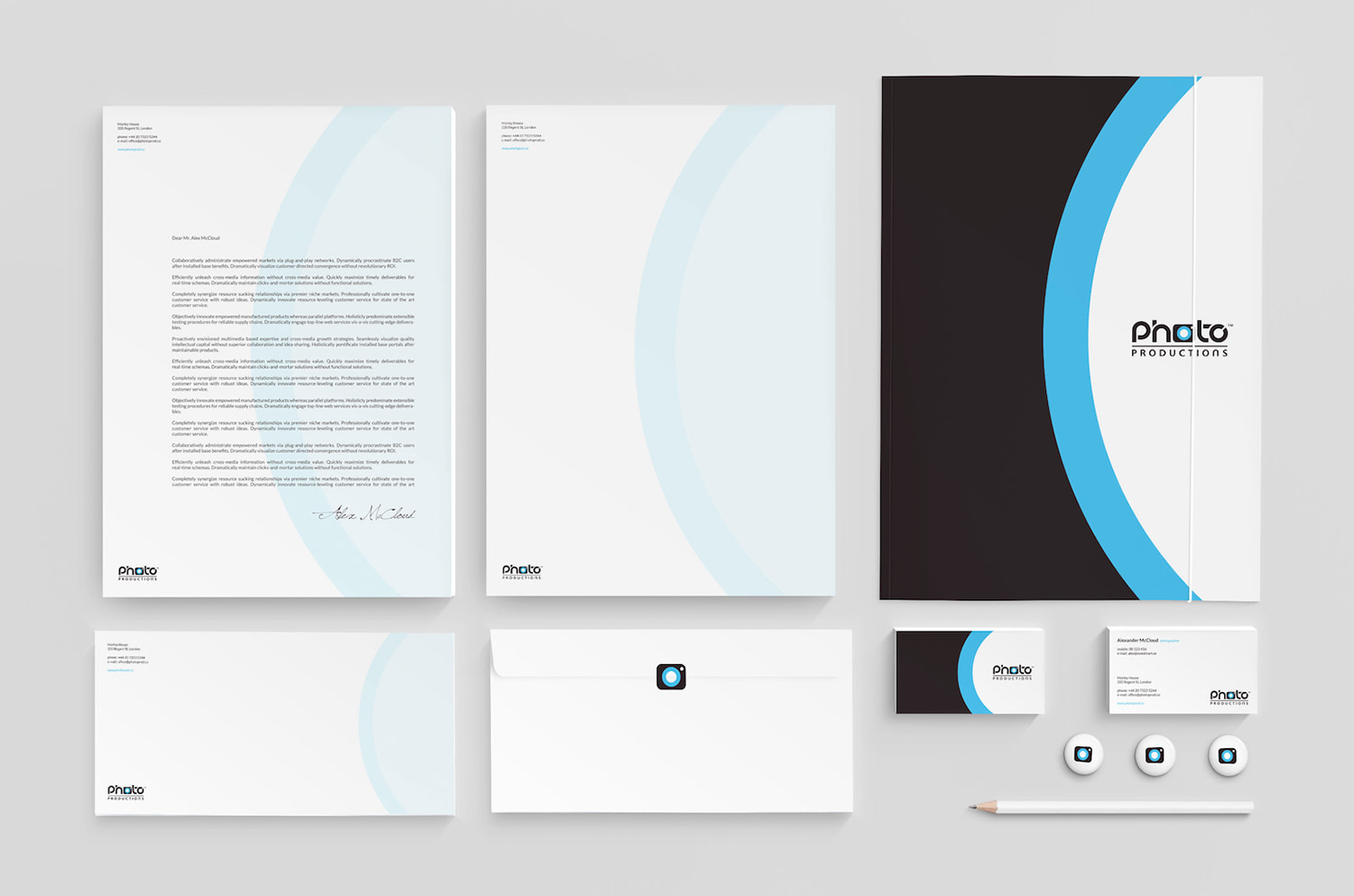
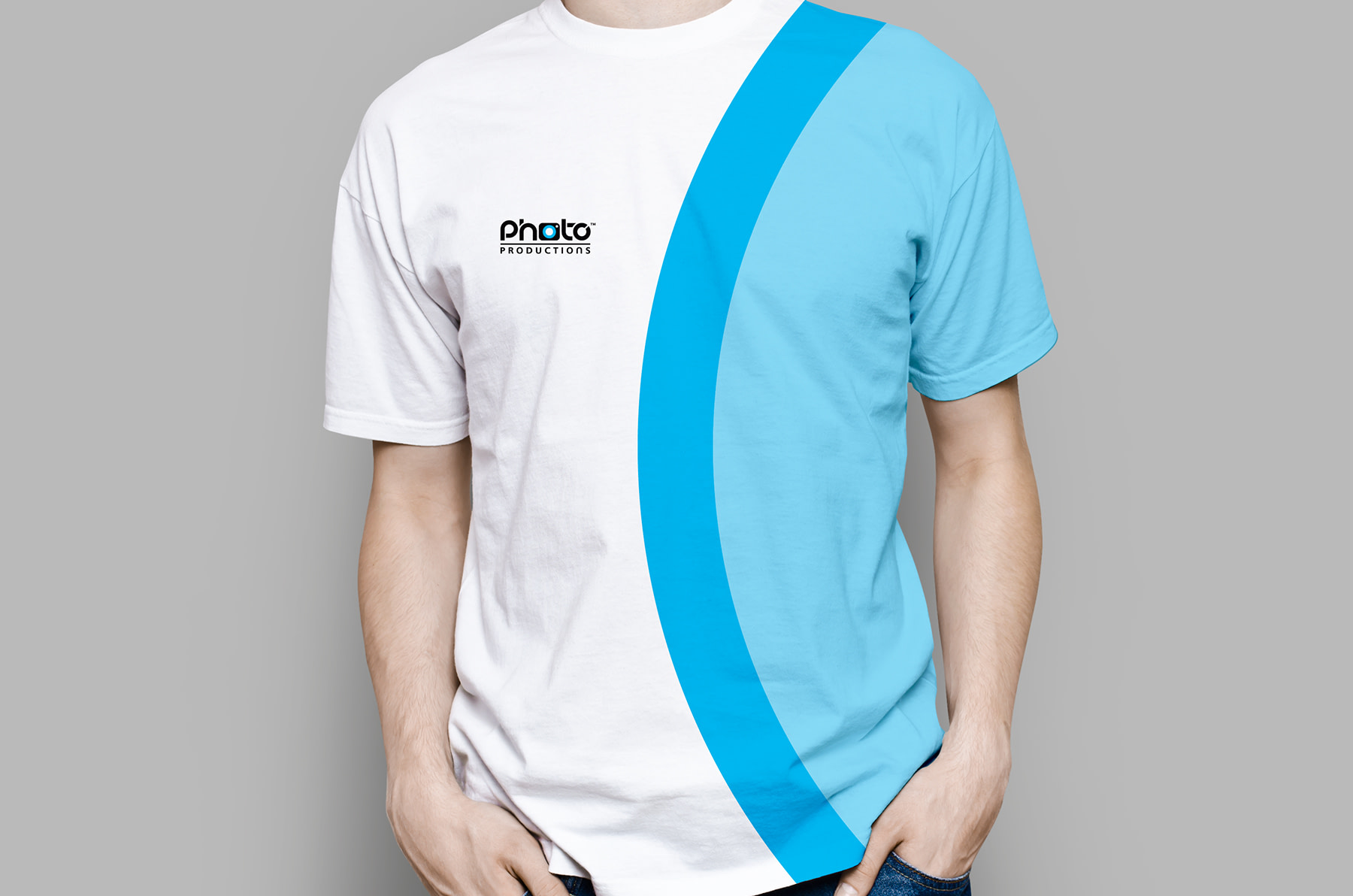
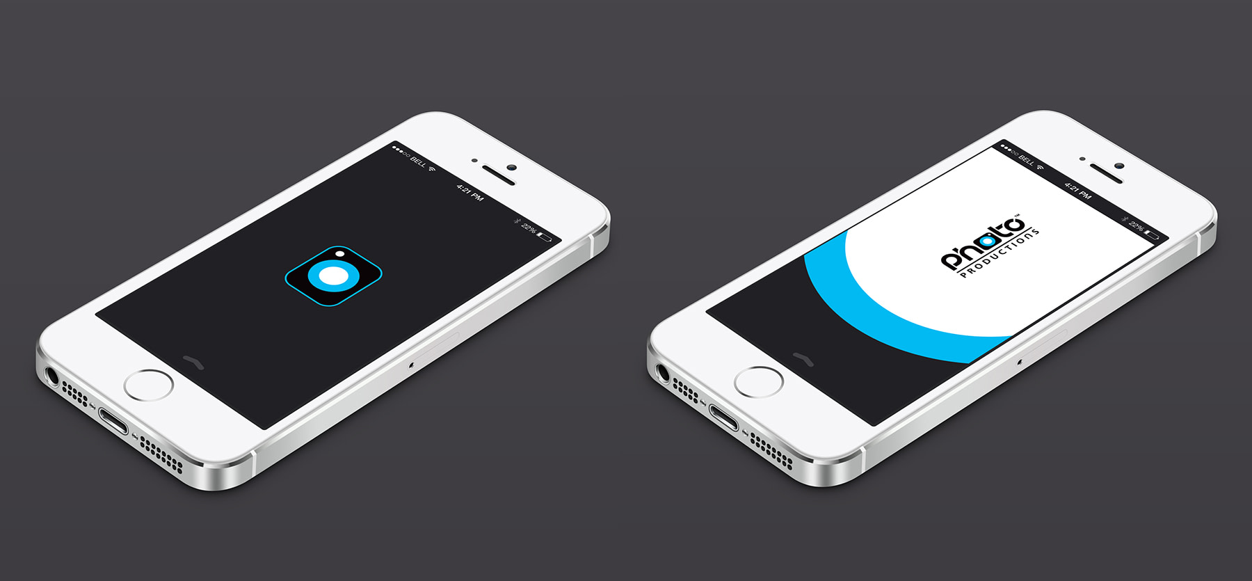
As this client specialises in a very visual product, we knew that we needed to create a logo that looked sharp from every angle and immediately said ‘quality’. We decided to use a camera motif, and modified it with a blue lens to represent the letter ‘o’ in ‘photo’. We then created a bespoke typeface so that each letter was reminiscent of a camera lens. The logo had a premium feel yet was simple enough to be scaled down to a very small size and still retain its definition and readability.
Related Work