There used to be a saying which ran something along the lines of ‘When America sneezes, the whole world catches a cold’, an aphorism designed to capture the overwhelming global financial clout of the USA. As the 21st century advances, it may well be that those with a keen eye on the general good health of the world are more inclined to watch out for China developing the sniffles, but the principle remains the same. When a big player does something different, it’s smart to pay particularly close attention, and in the fields of web design, internet searching and e-commerce, they simply don’t come any bigger than Google.
The change in question is an alteration which Google has made to its’ search algorithm. The search algorithm is the almost sacred, semi-mystical formula which Google uses to come up with its all-important page rankings – the brutally simple metric via which so many websites live or die. Along with every other web developer we make it our business to try and second guess the algorithms utilised by Google, and thus to create sites which work with them. In the past, many of the changes to the Google algorithm have been fairly subtle, concentrating search results, for example, on high quality content rather than simply picking up on keywords, but the latest change heralds a major rethink of the way in which all sites have to be designed.
Mobile friendly, mobile optimised and responsive
From here on in, the algorithms used by Google will examine a site in even more detail and give priority to those which are optimised for access via mobile use. This means that the design and development of a site are now every bit as important to its Google rankings as ‘traditional’ factors such as content and search engine optimisation.
While some developers may have been taken by surprise when this change was announced, we weren’t amongst them, since seasoned Google watchers will have been aware that they’ve gradually been shifting in this direction for some time. Recent guidelines, for example, have included tips on the most responsive approach to design, as well as advice on optimal page loading time, a factor which is vital when visitors to the site are using mobile devices. To put it simply, the direction of travel was clear.
The difference this makes is that a responsive website – one which works equally well and looks as good no matter what kind of device it is accessed from – is now a necessity rather than an added luxury. The new emphasis on the ever growing phenomenon of mobile searching will impact upon the Google ranking of a website in every language and all around the world.
In the words of Google, those people who access the web via a mobile device such as a tablet or smart phone should be able to “get relevant, high quality search results that are optimized for their devices.”
Buzzwords and terms such as ‘mobile friendly’ and ‘mobile optimised’ tend to be used far too easily by people steeped in the technology of development without the time being taken to stop and explain precisely what they entail. We like to make sure that our clients are completely on top of what we’re doing for them every step of the way, so we make it our business to explain exactly what we’re talking about and aiming for.
‘Mobile friendliness’ refers to the ability of a traditional desktop site to adapt to devices of all shapes and sizes. This means that the design, the content and the navigation will work just as well on smaller screens, providing a flawless and accessible experience for visitors whether they’re at their desk or on the move.
We think that the appearance of our sites, no matter what the shape, size and device, speaks for itself. If your website isn’t optimised for mobile then you’ll be losing out in terms of visitors, enquiries and, most important of all, revenue streams.
What to do now?
So we urge anyone considering a new website: it’s got to be responsive. A website without a mobile version is just not worth having. And we’re of course ready to help you.
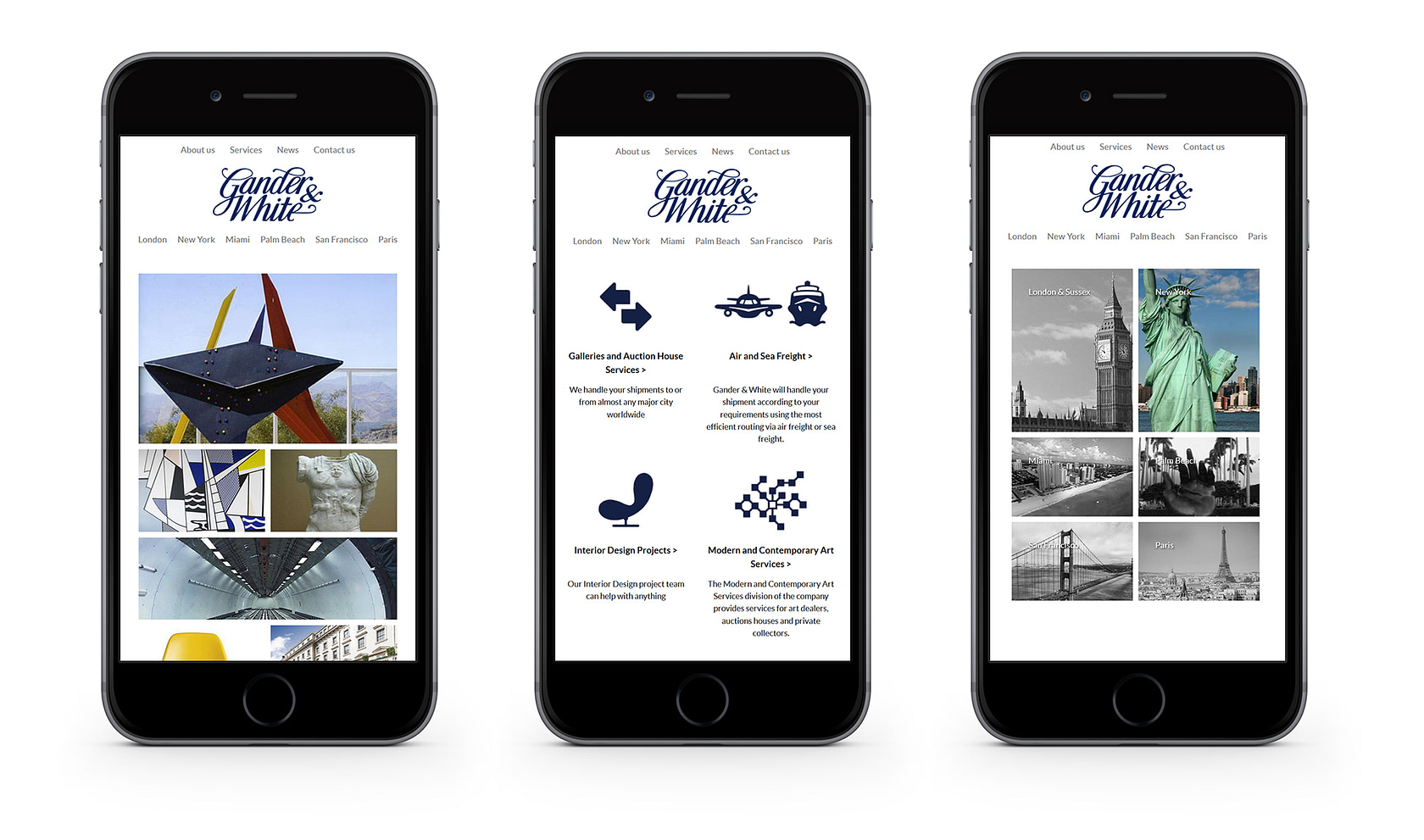
Conveniently, we have a few examples of sites we’ve designed recently which adapt to devices of all shapes and sizes:
CASE STUDY 1:
Gander and White Shipping – shipping and installation company, providing services to Art Dealers, Private Collections and Museums around the World.
Fully device responsive content managed website.

CASE STUDY 2:
Grant Macdonald – an internationally renowned Silversmith with a tradition of handmade quality, design and innovation..
Fully device responsive content managed website featuring full width slideshows on the homepage and gallery pages.
