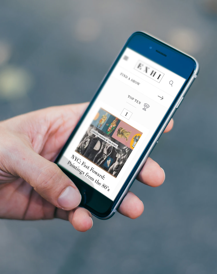
Nowadays all web design has to account for the fact that people won’t always be sitting comfortably at a desk and browsing through the site on a desktop PC.
They could just as easily be sat on a bus or a train or standing in the queue at Starbucks! As more and more people move to mobile and tablets when they’re on the hunt for information, it’s important to make sure that your website looks as good and works just as well on a small screen.
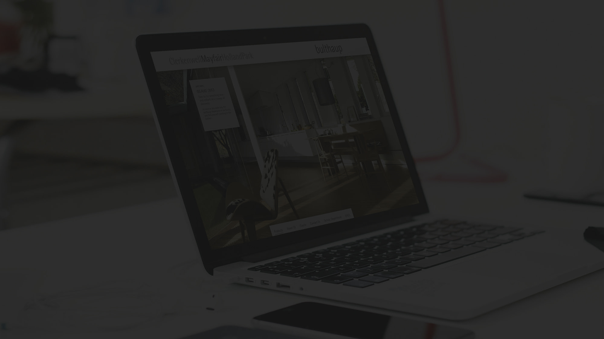
Responsive website design means that your site can easily adapt to smaller screen resolutions without losing any of the functionality or pleasing aesthetics.
Our responsive web design solutions will ensure that your website is flexible enough to work across all the latest platforms while still deliver a first class user experience.
Because you just never know where your next customer will be when they discover your site.
All our responsive websites are packed full of the latest features to ensure your site is super easy to use and manage.
– Bespoke solutions and content management systems with intuitive, easy to use admin screens.
– Create pages, format them, add your own images, sound files and video, and with one click your content is live.
– Link all your social media accounts including Facebook, Twitter, Google+, Tumblr, Dropbox, Instagram, Youtube, Linkedin, Vimeo, Flickr, Pinterest and Foursquare.
– Keep traffic coming to your site with Search Engine Optimisation campaigns, managed paid advertising and ongoing reports to ensure you’re targeting the right keywords. Contact our team of responsive web design London experts to find out more.